WORK IN PROGRESS ON THIS SECTION
The layout of a page determines the arrangement of the various elements and sections.
In a minimal web page layout, we should have at least three elements:
- the header
- the contents part
- the footer
A key concept here is that the header and footer are typically repeated in each and every page of a website. With exceptions and variations, of course.
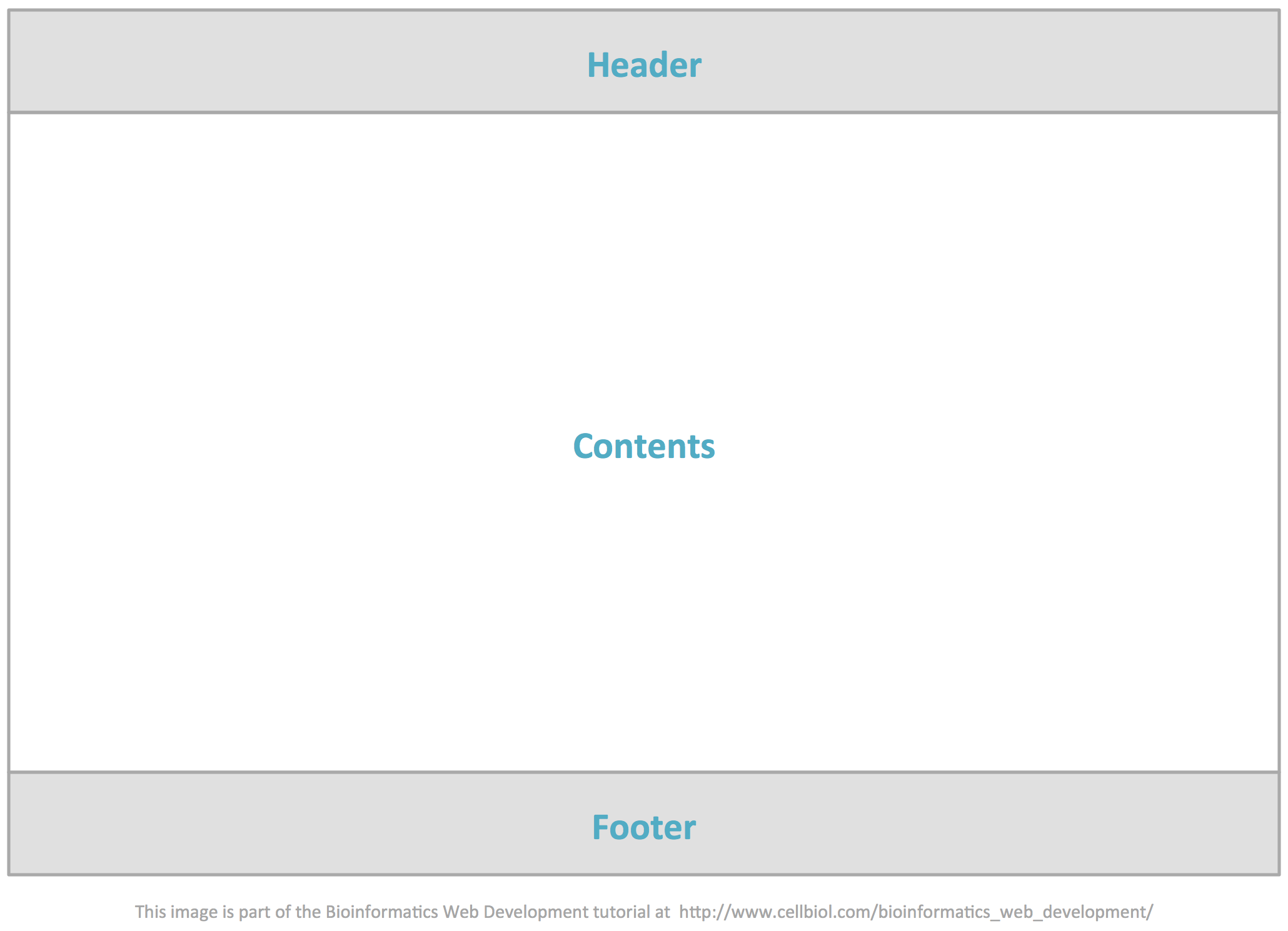
The header and footer can each have varying degrees of complexity.
Headers
There are no fixed rules for what should be in a header. However there are a number of elements typically included:
- Logo
- Site title
- Slogan
- Navigation menu
- Search box
Again, none of these are mandatory. The header itself is optional. However, if you find yourself designing an header, these are all elements you may want to consider for inclusion.
Let’s take for example the current header of the European Bioinformatics Institute (EBI) website, where some of these elements are used.

Header Markup
How are the various sections of the header rendered in HTML? No fixed rules, again.
- In HTML5 all the header contents could be conveniently enclosed in an header tag
- The logo will be an image (img tag)
- The title and slogan may be embedded in a span tag and be assigned an id, such as “site-title” and “site-slogan”, for example, for easy styling
- The navigation menu could be an ul list
- The search box is a web form, where the site can collect an input from the user, in this case a keyword to be searched across the web site, and process the input thanks to some kind of script running on the server. We will discuss web forms in the next section of this chapter
If an header tag is in place, you could use it as CSS context information to assign specific styles to header elements:
Remember that as discussed here, you could in principle have several header or footer elements in a page. In this case, you could assign an id to the main page header:
|
1 2 3 4 5 |
<header id="main-header"> ... </header> |
Footers
In the last years, especially on big web sites, footers are increasingly becoming little worlds on their own, often holding a full fledged, nicely organized site map.
Let’s have a look at the footer of the NCBI Pubmed web site, to clarify this point:
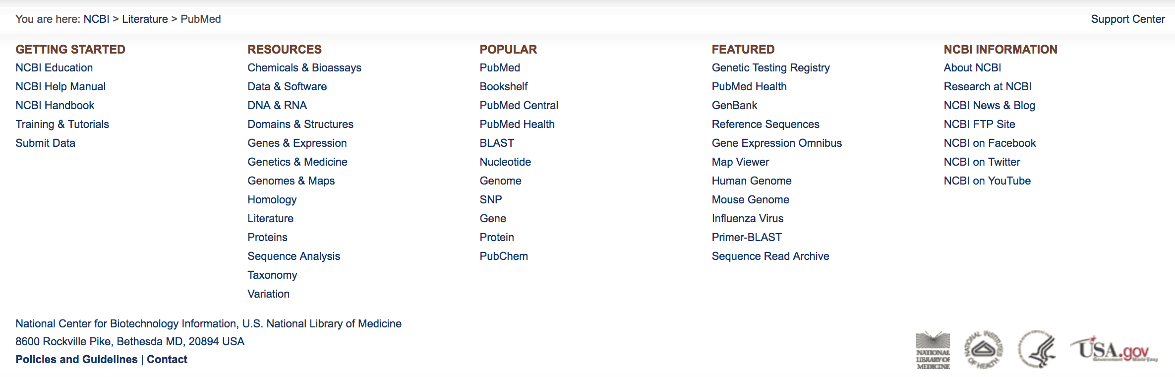
You may perform a pubmed search and check that this footer is indeed preset in all the pubmed pages.
The footer of the European Bioinformatics Institute (EBI) website follows a similar pattern:

The footer could instead be extremely simple, containing for instance just a contact e-mail address, a copyright notice, a graphical element. In HTML5 all footer contents could be enclosed in a footer tag. Given the variability of the footer contents, we will not give any markup guidelines.
If a footer tag is in place, you can use it as CSS context information to assign specific styles to footer elements:
|
1 2 3 |
footer a {text-decoration : underline;} |
Contents Section
In the simple model in figure 3-10-1, the actual contents of a page, the only thing (as a first approximation) that changes from one page to another in the same web site, or website section maybe, are included in a “contents” block sandwiched between header and footer.
This contents block could be a single “box”, or could be partitioned or subdivided in some way, to create a more or less complex layout.
The main way we can think about sectioning the contents area is to create columns. For example a side column, either on the left or right side, could be dedicated to navigation elements and side boxes with various information.
Sectioning possibilities are endless, and only depend on your creativity and the actual needs of the particular website you are working on.
For example news sites, such as newspapers web site, that must present a lot of varied contents in their home pages, will typically have a complex arrangement, where the main columns are further subdivided to accommodate a variety of boxes, with different styles applied to them so as to make them easily recognizable by the visitor.
Creating page layouts with HTML and CSS
How can we achieve such layouts by using HTML and CSS?
The main elements that we propose to use for the creation of layouts for this course are:
- header
- aside
- div
- footer
You could get the job done nicely by just using div. However the new tags in HTML5 provide added flexibility and a more semantic approach to the markup and styling processes for layout creation.
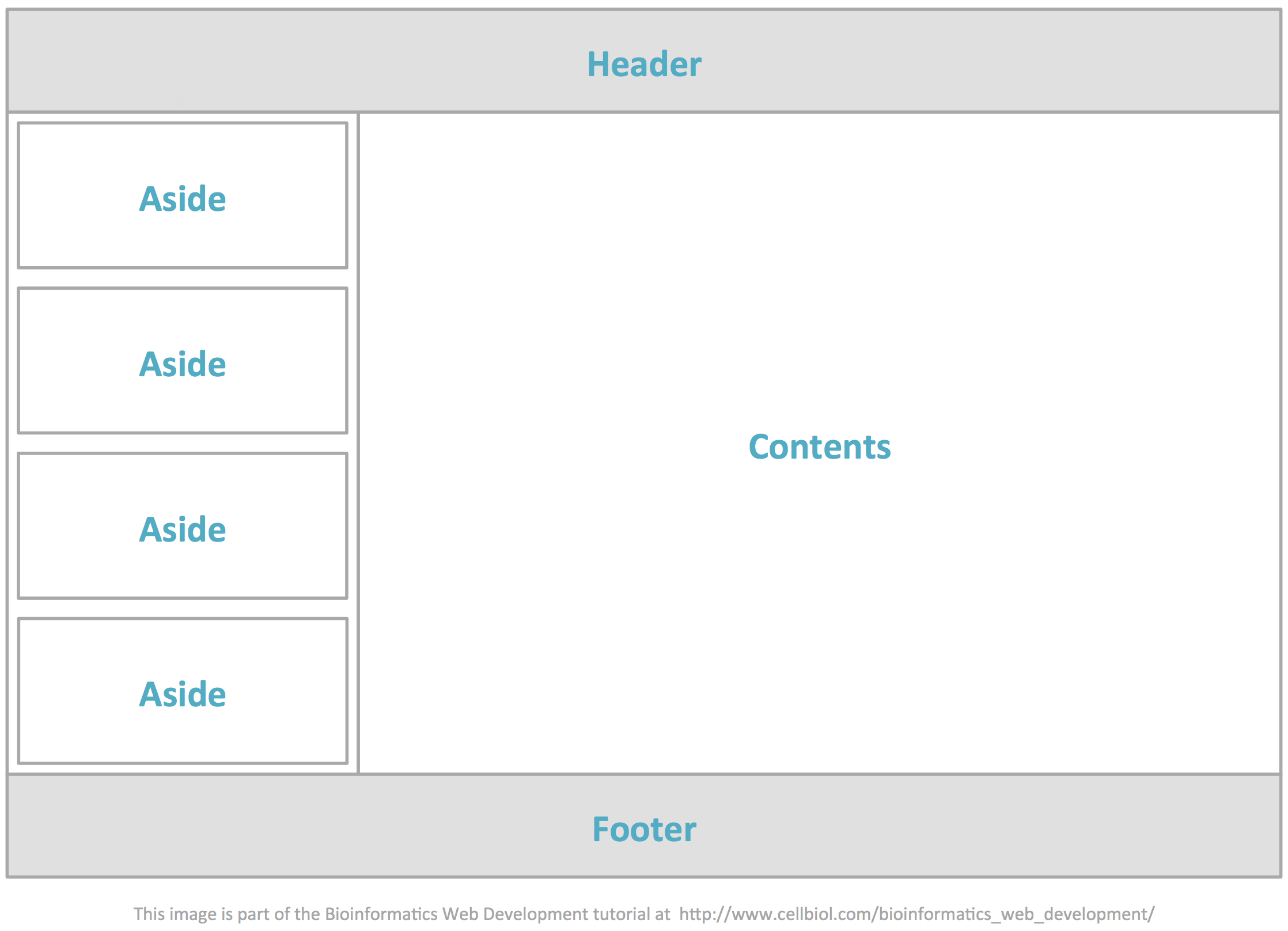
We will provide an example of how to achieve the layout in figure 3-10-5. This is a basic layout that should be suitable for most projects. It can of course be elaborated further, and used as starting code to achieve more complex layouts.
We have already provided instructions here to style the html and body tags so as to render the body as basic rectangle, 980 pixels wide, centered in the page. This provides a starting basis to design our web page template to get the layout in figure 3-10-5.
A simple exercise with divs
Before we get to this layout, let’s make an apparently simple exercise that consists in arranging a few div elements in a page exactly as we want them. In doing this you will learn about a few styling caveats you should be aware of.
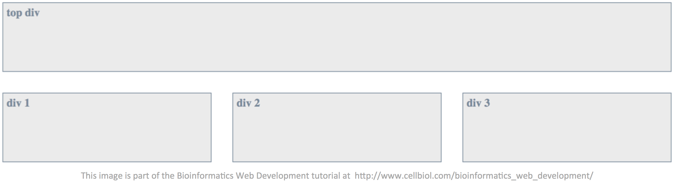
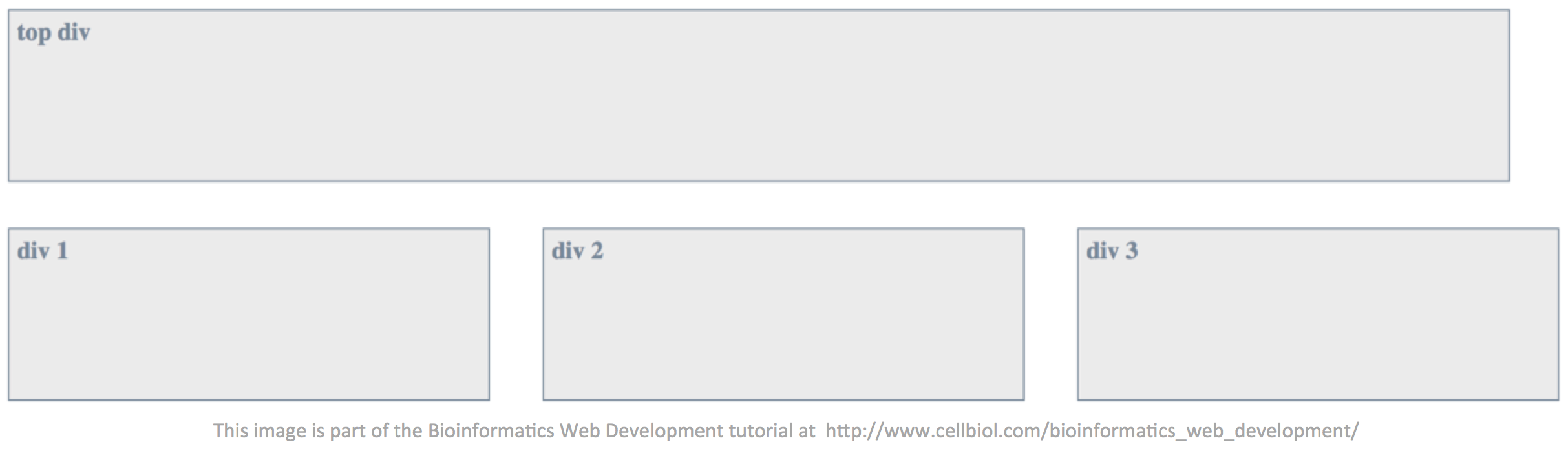
The result we wish to achieve is a top div 960 pixels wide followed below by three divs 300 pixels wide each, perfectly spaced and aligned with the top div, as shown in the figure below. All divs will have a 1 pixel border, an height of 100 pixels and a 5 pixels padding for keeping the enclosed text slightly away from the borders.
Please give it a try on your own before proceeding. You will see that this may well not be as easy as it would seem at a first glance.
Here is a tentative HTML code for the page (that will create problems, keep reading):
|
1 2 3 4 5 6 |
<div class="test box1">top div</div> <div class="test mybox">div 1</div> <div class="test mybox">div 2</div> <div class="test mybox last">div 3</div> |
We have assigned all the divs a class “test” as they have some common features such as the height, the type of border, the text styling, the padding, the background color. The three bottom divs have a “mybox” class and the last of those have a “last” class.
Divs are block elements, so with no styling at all this is what you will see on the page, basically the text within the divs:
top div
div 1
div 2
div 3
In order to render the three bottom divs as inline instead of block, we will use the inline-block value for the display property. inline-block elements are like inline elements but they can have a width and a height, which is very important to create a layout based on divs (or other container elements).
|
1 2 3 4 5 |
div.mybox{ display:inline-block; } |
Before we style the classes let’s do some calculations.
We said that the top div should have a width of 960 pixels, while the bottom divs should have a width of 300 pixels. Therefore:
960 – (300 x 3) = 60
we apparently have 60 pixels to use to space the three bottom divs. So 30 pixels of margin-right after the first and second divs should provide a perfect spacing. We do not want any margin-right after the third bottom div. The “last” class was assigned to the third bottom div for this purpose.
Here’s a first tentative styling:
|
1 2 3 4 5 6 7 8 9 10 11 12 13 14 15 16 17 18 19 20 21 22 23 24 25 |
div.text{ /* applied to all divs */ background-color: #EBEBEB; /* a light grey */ border: 1px solid LightSlateGrey; /* slategrey is a bluish grey */ height: 100px; padding: 5px; margin-bottom: 30px; color: LightSlateGrey; /* text color */ font-weight: bold; } div.box1{ /* the top div */ width: 960px; } div.mybox{ /* the three bottom divs */ width: 300px; display: inline-block; /* used to display the three bottom divs inline */ margin-right: 30px; } div.last{ /* the last of the three bottom divs */ margin-right: 0; } |
We may think that the job is done. Let’s have a look a the whole thing in a browser.
The HTML page code may be as follows:
|
1 2 3 4 5 6 7 8 9 10 11 12 13 14 15 16 17 18 19 20 21 22 23 24 25 26 27 28 29 30 31 32 |
<style> div.test{ background-color: #EBEBEB; border:1px solid LightSlateGrey; height:100px; padding:5px; margin-bottom: 30px; color:LightSlateGrey; font-weight:bold; } div.box1{ width:960px; } div.mybox{ width:300px; display:inline-block; margin-right:30px; } div.last{ margin-right:0; } </style> <div class="test box1">top div</div> <div class="test mybox">div 1</div> <div class="test mybox">div 2</div> <div class="test mybox last">div 3</div> |
On visiting this web page, surprise surprise, this is what we get.
What is wrong with our code above? There are two main issues. All containers have a property called box-sizing, whose default value is “content-box”. When box-sizing have a value of content-box, the width assigned to a container such as a div strictly applies to the container itself. The padding and border are excluded. So the actual real width of our three bottom divs to which we assigned a width of 300 pixels is:
300 + 10 (padding left and right) + 2 (border left and right) = 312 pixels.
In order to fix this we should explicitely assign to box-sizing a value of “border-box” instead of “content-box”.
The second problem is in the HTML code itself. We have separated the divs by newlines in the source code. Newlines are rendered as spaces, which add width in between the divs.
To make a long story short, here is a code that will properly space and align the divs as we wanted them:
|
1 2 3 4 5 6 7 8 9 10 11 12 13 14 15 16 17 18 19 20 21 22 23 24 25 26 27 28 29 30 31 |
<style> div.test{ box-sizing: border-box; background-color: #EBEBEB; border:1px solid LightSlateGrey; height:100px; padding:5px; margin-bottom: 30px; color:LightSlateGrey; font-weight:bold; } div.mybox{ width:300px; display:inline-block; margin-right:30px; } div.box1{ width:960px; } div.last{ margin-right:0; } </style> <div class="test box1">top div</div><div class="test mybox">div 1</div><div class="test mybox">div 2</div><div class="test mybox last">div 3</div> |
Creating a layout with columns
Let’s now go back to the layout in figure 3-10-5.
We will have the following main page sections (see figure 3-10-5):
- Header, delimited by “header” tags
- Left sidebar, delimited by a div with id “sidebar”
- Within the left sidebar, a few “aside” blocks in which the contents of the sidebar are organized
- Main contents, to the right of the sidebar. Delimited by a div with id “main-contents”
- Sidebar and main contents will be placed within a div with id “center-contents-block”
- Footer
Here’s the basic code. It only provides an empty, generic layout for the page. We will follow a progressive enhancement approach: first a correct HTML, then styling with CSS.
HTML source code:
|
1 2 3 4 5 6 7 8 9 10 11 12 13 14 15 16 17 18 19 20 21 22 23 24 25 26 27 28 29 30 31 32 |
<!DOCTYPE html> <html lang="en"> <head> <title>…</title> <link rel="stylesheet" href="css/style.css" type="text/css"> </head> <body> <header> … </header> <div id="center-contents-block"> <div id="sidebar"> <aside> … </aside> <aside> … </aside> </div> <div id="main-contents"> … </div> </div> <footer> … </footer> </body> </html> |
Very little styling is needed to arrange the sections as in figure 3-10-5: we have to define the widths of the sidebar and the main-contents divs and somehow place the sidebar div to the left of the main-contents div. With these two specifications, in addition to the body tag styling we mentioned above, we will have the layout in figure 3-10-5.
Here are the essential CSS declaration we need. Mind that, to get a really nice layout, much more than this is needed. Those are just the very basic declarations to achieve the relative arrangement of sections shown in figure 3-10-5.
As usual, we will place those declarations in the css/style.css file that is linked from the head of the HTML page.
|
1 2 3 4 5 6 7 8 9 10 11 12 13 14 15 16 17 18 19 20 21 22 23 24 25 26 27 |
body { margin-left : auto; margin-right : auto; width : 980px; } #sidebar { width : 300px; display:inline-block; } #main-contents { width : 660px; display:inline-block; } aside { -moz-border-radius: 15px; /* those two declaration are to get round boders for the asides, as in fig 3-10-5, across browsers */ border-radius: 15px; width:280px; margin-bottom:5px; /* to space on aside from the next */ margin-right:auto; /* margin-left and right set to auto will center the asides in the enclosing div */ margin-left:auto; } |
You may note that the added widths of sidebar plus main-contents is not 980 pixels, but 960. This is because, typically, we will also add 10px right and left paddings for the body at a certain point. On calculating widths, all the pixels, including margins and paddings of the elements themselves and surrounding/parents elements should be considered, otherwise the final result might not be satisfying.
The key on having the sidebar to the left of the main-contents div is to use a display:inline-block declarations for both the sidebar and main-contents divs. Also refer to the divs arrangement exercise that we performed above.
As an exercise, we leave it to you to combine the code provided in the previous section with the one in this section to create a basic page with a nice layout, maybe like the one in figure 3-10-5 and a personal style. Select a nice color scheme and go ahead in the creation of your own page and styles. Keep in mind that this page will be the foundation for subsequent work. Your own page/layout/style will be a template for the input and output pages of all the Bioinformatics web applications that you will develop during this course, and hopefully in the future.
You now have all the elements to design your own web pages. On stepping up from a web page to a web site, there are a number of things to consider. In particular, when the number of pages grows, it becomes increasingly difficult to manage and edit each and any web page of the site individually.
Just to make an example, imagine you have a 10 pages website in which each page has a navigation menu that links to all the pages in the site. One day, you add one more page, page 11. In a static web site, you will need to edit each of the 10 pages to add page 11 to the navigation menu of each page. You see how if you have 100 pages instead of 10, the matter gets complicated (and therefore prone to errors and less appealing to do).
We need to put in place some mechanism that allow us to control at least certain parts of the pages, for example their general layout and appearance and their navigation menus in some central, common location. In order to do this, we need to switch from the static website paradigm, to so called “dynamic” web sites.
In order to build a dynamic web site we necessarily need some form of programming language. HTML and CSS, although still essential, are not enough. For this reason, in the next chapter we start learning the basics of PHP. You will see that for the mere purpose of turning a static site into a dynamic site, we only need a few PHP statements that are extremely easy to understand and manage, even if you don’t even know what programming is about. So you can move to the next chapter with no fear. Before that, let’s learn to design a web form for collecting data from visitors.
Chapter Sections
[pagelist include=”135″]
[siblings]