We will now style a sample HTML page.
Progressive Enhancement
The developing approach we follow in this example is known as progressive enhancement, which is an important paradigm in web programming. It consists in adding progressive layers of complexity to a page.
We start from a perfectly marked up HTML page, this is the foundation. By itself, this should be visualized correctly on any platform, although it might not be particularly nice, as default browser settings are applied.
We then add a layer of CSS, by marking tags with id and class attributes, as required, and then associate these ids and classes, and maybe also main elements, to a style by linking a stylesheet to the page.
A subsequent step could be to add some javascript code, to obtain some specific dynamic or interactive behavior.
The general principle is that all layers beyond the basic one should each add value to the page, while remaining optional. The page should still be functional at it’s basic level. Not all devices/platforms support CSS. Even less may support javascript. So the user will get the full experience for example on a PC with a modern browser. However the page should (possibly) still be accessible and displayed correctly, although sometimes not nicely, on any device.
Sample Page
Here’s the source of our starting page:
|
1 2 3 4 5 6 7 8 9 10 11 12 13 14 15 16 17 18 19 20 21 22 23 24 25 26 27 28 29 30 31 32 33 34 35 36 37 38 39 40 41 42 43 44 45 46 47 48 49 50 51 52 53 54 55 56 57 58 59 60 61 62 63 64 65 66 67 68 69 70 71 72 |
<!DOCTYPE html> <html lang=”en”> <head> <meta charset="UTF-8"> <title>Testing Style Sheets</title> <meta name="description" contents="This page serves the purpose of testing style sheets on a variety of different elements"> </head> <body> <header> <img src="images/dna_square_100x100.png" alt="dna square"> <h1>Testing CSS</h1> <nav> <h1>Navigation Menu</h1> <ul> <li><a href="page1.html">page1</a> – </li> <li><a href="page2.html">page2</a> – </li> <li><a href="page3.html">page3</a></li> </ul> </nav> </header> <aside> <h1>Tangentially related stuff</h1> <div> <h2>Cool Links</h2> <ul> <li><a href="http://www.w3schools.com">W3 Schools</a></li> <li><a href="http://www.php.net">Official PHP Website</a></li> <li><a href="http://www.ncbi.nlm.nih.gov/pubmed">Pubmed</a></li> </ul> </div> <div> <h2>Daily quote</h2> <p>It is a scientific fact that your body will not absorb cholesterol if you take it from another person’s plate</p> </div> </aside> <p>This page has the purpose of testing CSS. <br> What follows is a random list of elements, inserted only because we will style it. <ul> <li>First list element</li> <li>Second list element</li> <li>Third list element</li> </ul> </p> <h2>Section 1: Web Applications</h2> <p>This is the first section of this page, it is about web applications for Bioinformatics.</p> <h3>Input</h3> <p>This is the "Input" subsection.<br> It focuses on how we get data from the user.<br> This is usually done through a web form.</p> <h3>Output</h3> <p>This is the "Output" subsection</p> <h2>Section 2: Web Files</h2> <p>This is the second section of this page, it is about web files. How to create them, upload them, edit them.</p> <h3>Editing files</h3> <p>This is the "Editing" subsection<br> This subsection contains a <a href="http://www.ncbi.nlm.nih.gov/">link to the NCBI web site</a></p> <footer> The material on this website is © cellbiol.com </footer> </body> </html> |
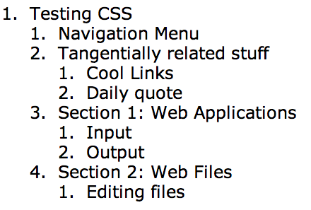
The document outline, as assessed with the HTML5 outliner is shown in the next figure. Remember that the document outline is not something that browsers will display. It represents the high level hierarchical arrangement of the various parts/contents of the page on a semantical level.
The next figure shows how the page is displayed in a browser
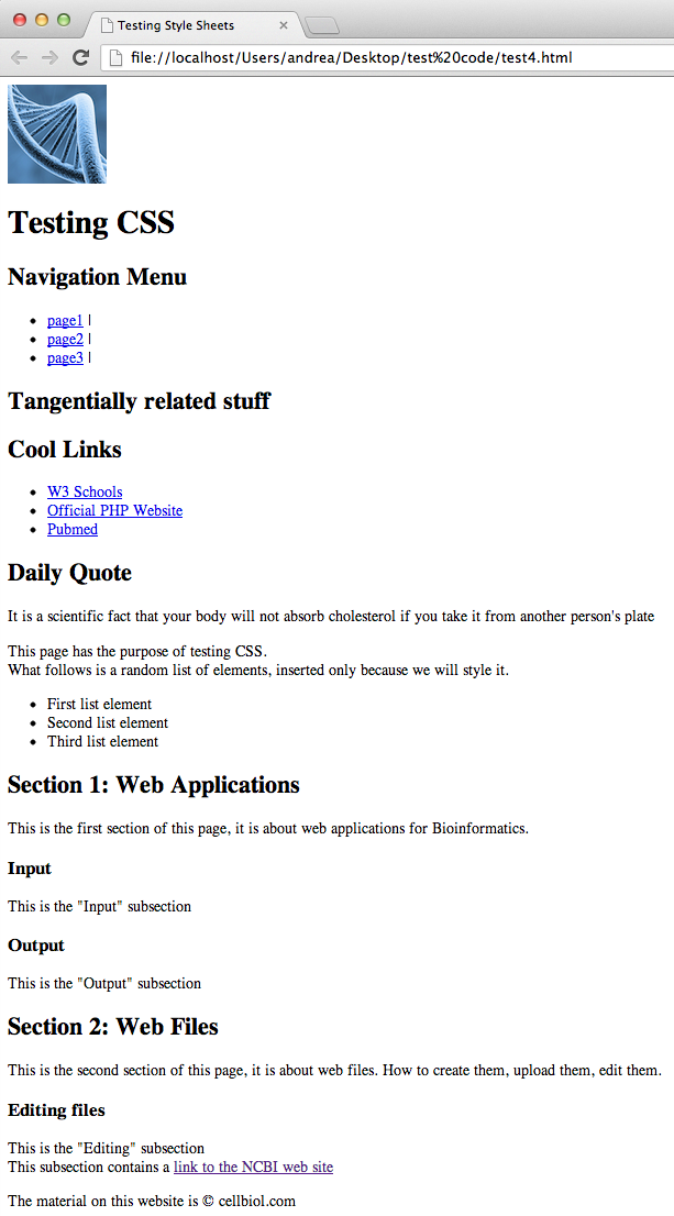
Note how although the page is not particularly nice, it is perfectly readable, and the various sections and subsections are clearly defined. The accessibility of such a page is very good across a wide range of devices, including for instance mobile phones.
We will now create a stylesheet called “style.css” in a folder called “css”, located in the same directory as the html file. We will link this in the head of the HTML page as css/style.css. Let’s add the following line to the head section:
|
1 2 3 |
<link rel="stylesheet" href="css/style.css" type="text/css"> |
From now on, all styles definitions for our html page will be written to this stylesheet.
Let’s go straight to the final result and then comment, step by step, on how it was achieved.
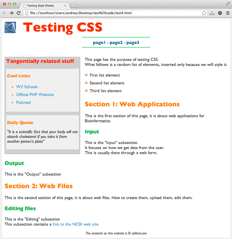
See how this looks very different from the previous unstyled version.
As a general principle, it is wise to attribute a style to the highest possible element in the tags hierarchy, considering that many style definitions will then be inherited by child elements thanks to the cascading nature of the Cascading Style Sheets. This is why we will start from the html and body tags.
Styling the html and body tags
Background Colors
You see in figure 3-9-3 that the body has a white background, however around it there is a grey background that will fill the whole window in the part not occupied by the body. In order to achieve this, we have to attribute a background color to both the html tag, the very opening tag of the page, and to the body tag:
|
1 2 3 4 5 6 7 8 9 |
html { background-color : #F0F0F0; /* this is a light grey */ } body { background-color : white; } |
Page width
Concerning the page (body) width, there are two main options. The width can be expressed as a percentage of the window width (eg: width : 95%;). Or it can be expressed with an absolute measure, typically in pixels (eg: width : 980px;). This is an important choice that will impact strongly on the behavior of your pages.
There is an important design trend called responsive web design, that if focused on producing code layouts that will adapt across the full range of devices and screen sizes available on the market. Responsive design is based, among other techniques, on the use of dedicated elements such as the viewport tag. This is a potentially complex matter beyond the scope of this book.
Here are couple of useful introductory resources on responsive web design to get you started:
We will propose a simple fixed-width basic page stile, that is quite suitable for most projects and easy to manage and understand. Once you can master basic designs, you can proceed to more sophisticated layout codes. Since most monitors in use are now 1024 pixels wide or more, we will select a size that will fit into these monitors without any horizontal scrolling, which is generally regarded as an uneducated option to offer visitors of a modern web site. While it is a good idea to specify a width, the height should not be specified so that it will adapt to the contents and stretch vertically as required.
|
1 2 3 4 5 6 |
body { background-color : white; width : 980px; } |
Using margins to center elements
We want these 980 pixels to be at the center of the user window, rather than to the left (the default). In oder to center the body into the browser window, we use the “margin” property. The margin of an element is a distance to be kept from other elements in the page. We can specify either just a margin, that will apply to the four directions, or, if we need more control over the four directions, individually:
- margin-top
- margin-bottom
- margin-left
- margin-right
The names are quite self-explanatory but see also the next figure. In oder to center an element in the page, such as the body itself, but also a div or other containers, we can indicate that the left and right margins should have a value of “auto”:
|
1 2 3 4 5 6 7 8 |
body { background-color : white; width : 980px; margin-left : auto; margin-right : auto; } |
The margin shorthand property
Top, right, left and bottom margins can also assigned within a single CSS declaration by using the generic “shorthand” property margin.
Shorthand properties are CSS properties that allow to set the value of several CSS properties simultaneously, allowing to keep the CSS declarations more compact. For example, margin is a shorthand to the four properties margin-top, margin-right, margin-bottom and margin-left.
The margin shorthand can be called with 4, 3, 2 or 1 values.
With 4 values
|
1 2 3 4 5 |
div.mydiv { margin : 10px,15px,20px,30px; } |
The four numbers refer to the top, right, bottom, left margins, respectively. So in the above example margin-top would be 10px, margin-right 15px, margin-bottom 20px and margin-left 30px.
With 3 values
|
1 2 3 4 5 |
div.mydiv { margin : 10px,15px,20px; } |
The 3 numbers refer to top, right+left, and bottom, respectively.
With 2 values
|
1 2 3 4 5 |
div.mydiv { margin : 10px,20px; } |
The 2 numbers refer to top+bottom and right+left. So in this example margin-top and margin-bottom would be 10px while margin-right and margin-left would be 20px.
With one value
|
1 2 3 4 5 |
div.mydiv { margin : 20px; } |
The value applies to all four margins, top, right, bottom, left.
Therefore, keeping in mind that the default value for all margins that will be applied by the browser if we do not specify any margin property is 0, instead of writing:
|
1 2 3 4 5 6 7 8 |
body { background-color : white; width : 980px; margin-left : auto; margin-right : auto; } |
we could write:
|
1 2 3 4 5 6 7 |
body { background-color : white; width : 980px; margin : 0 auto; } |
Web Fonts
Let’s now select a font for our text. Font selection has an overall strong impact on the page appearance. Needless to say, different fonts could be used in different parts of our page(s). For example, the font for navigation menus could be different from the font used for generic text.
Web safe fonts
Fonts and web fonts are a world worth exploring. As a general note, you should be aware that in order for a font to be used in a web page, the font should be available on the client computer/OS. This restricts the use of possible fonts to a relatively small number of fonts commonly present on all operating systems Those fonts are known as web safe fonts.
@font-face to import external fonts in the web page
An alternative to use a web safe font is to embed a font in our web pages, by using a @font-face declaration, so that the font is downloaded to the client PC from an external source.
This external source could be our server, or maybe a third party fonts server. A great variety of fonts can be sourced from font libraries such as fontlibrary or Google fonts.
Let’s stick to common fonts for now. Here’s a nice selection of 16 commonly used fonts that are safe to use on the web.
For the purpose of our sample page, we have decided to use “Gill Sans”. If a font name contains spaces, it should be enclosed within quotation marks.
|
1 2 3 4 5 6 7 8 9 |
body { background-color : white; width : 980px; margin-left : auto; margin-right : auto; font-family : "Gill Sans", sans-serif; } |
Font families
You may have noted that in this example the font-family property was assigned two values: “Gill Sans” and “sans-serif”.
The second font is indicated so that if the first font is not available, the browser will attempt to use the second instead. Several fonts can be used in a font-family declaration, that will be subjected to this same fallback mechanism.
Also note that there are 2 kind of font names, those that indicate a specific font family, such as Times new roman or Gill sans, and those that indicate a group of fonts (font family) that look alike or share some common features, for example “serif”, “sans serif” or “monospace”.
Serif and sans-serif
The next figure illustrates the difference between serif and sans serif font families.
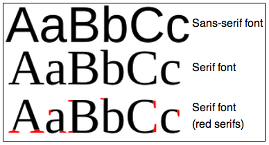
It is wise to start the font-family declaration with a specific font family, the one we would prefer to be displayed, and to end with a generic font family, so that at worse, a similar font to our favorite will be used anyway.
Monospace fonts
The “monospace” group comprises courier, courier new and Lucida Console. A font of this group is generally selected to display biological sequences, such as DNA, RNA or Protein sequences. Characters from this group of fonts have all the same width (hence the name “monospace”). This is very desirable on displaying sequence alignments, where we wish aminoacids in the corresponding positions in the sequences, to be aligned vertically with each other. This will only work with monospace fonts.
For styling a sequence we could embed all sequences in a span tag with a sequence class and then use, for example, the following declaration:
|
1 2 3 |
.sequence{font-family : "Lucida Console", Courier, monospace;} |
Font Size
We can set a default font size for text, with the font-size property. Let’s use, for this example, 1.2em. In a standard browser this corresponds approximately to 19 pixels, which is extremely well readable. The size you select will also depends on the selected font family.
|
1 2 3 4 5 6 7 8 9 10 |
body { background-color : white; width : 980px; margin-left : auto; margin-right : auto; font-family : "Gill Sans", sans-serif; font-size : 1.2em; } |
Default text color
As a first thing, you should be aware that the default browsers color for almost everything, including text, is black, which is a strong color, far from neutral. We suggest you avoid black altogether, unless you really want it. The decision of using black should be explicit. If you look carefully at figure 3-9-3 you will notice that the text is not black.
So let’s set the default text color to a dark grey, right into the body declaration so that it will nicely cascade into all our web page text:
|
1 2 3 4 5 6 7 8 9 10 11 |
body { background-color : white; width : 980px; margin-left : auto; margin-right : auto; font-family : "Gill Sans", sans-serif; font-size : 1.2em; color : #404040; /* this is a dark grey. This is now the default color for all the text in our page */ } |
Padding
As things stand now, if we add contents, for example some text or an image, to the body, it will touch the page border (by default, the left border). This is plain ugly, and a typical sign of bad and sloppy web design. In oder to leave an internal margin in the body, we will use the padding property.
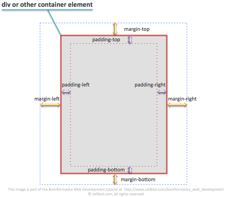
Compare the margin and padding properties in figure 3-9-4.
10 pixels will be fine:
|
1 2 3 4 5 6 7 8 9 10 11 12 |
body { background-color : white; width : 980px; margin-left : auto; margin-right : auto; font-family : "Gill Sans", sans-serif; font-size : 1.2em; color : #404040; /* this is a dark grey. This is now the default color for all the text in our page */ padding : 10px; } |
however in this particular case we do not want any padding at the top of the page:
|
1 2 3 4 5 6 7 8 9 10 11 12 13 |
body { background-color : white; width : 980px; margin-left : auto; margin-right : auto; font-family : "Gill Sans", sans-serif; font-size : 1.2em; color : #404040; /* this is a dark grey. This is now the default color for all the text in our page */ padding : 10px; padding-top : 0; /* 0 is the only numeric value with which we can omit the measuring units */ } |
When we assigned “padding : 10px;”, we implicitly assigned the value of 10 px to padding-top, padding-botton, padding-left, padding-right. As it happens with margin, padding is a shorthand property.
When we subsequently declare “padding-top : 0;”, we override the previous declaration, in particular the padding-top part. So at the end, the last declaration wins.
If we did write instead:
|
1 2 3 4 |
padding-top : 0; padding : 10px; |
the final padding-top value would be 10px. Remember that in CSS, the order of the declarations is one of the CSS precedence criteria.
Styling the h tags
What about the color of titles and subtitles (defined by h tags, from h1 for the main title, to h6)? As you see in figure 3-9-3, we have used colors quite heavily in our example to underline the page subdivision in sections and subsections. In the example, only h1, h2 and h3 tags were used, of the 6 h tags available.
Selecting a color scheme
As already discussed in a previous section of this chapter, on designing a web page of web site it is wise to plan in advance and select a beautiful, harmonic color scheme. For this example we have selected the following color scheme:
http://paletton.com/#uid=7080u0kw0w0jvDaoOy4y4oODajv
at the paletton.com web site. To see exactly what is shown in the figure below in the paletton web site please visit the URL above an then select the tetrad option in the circular selectors right below the site logo.
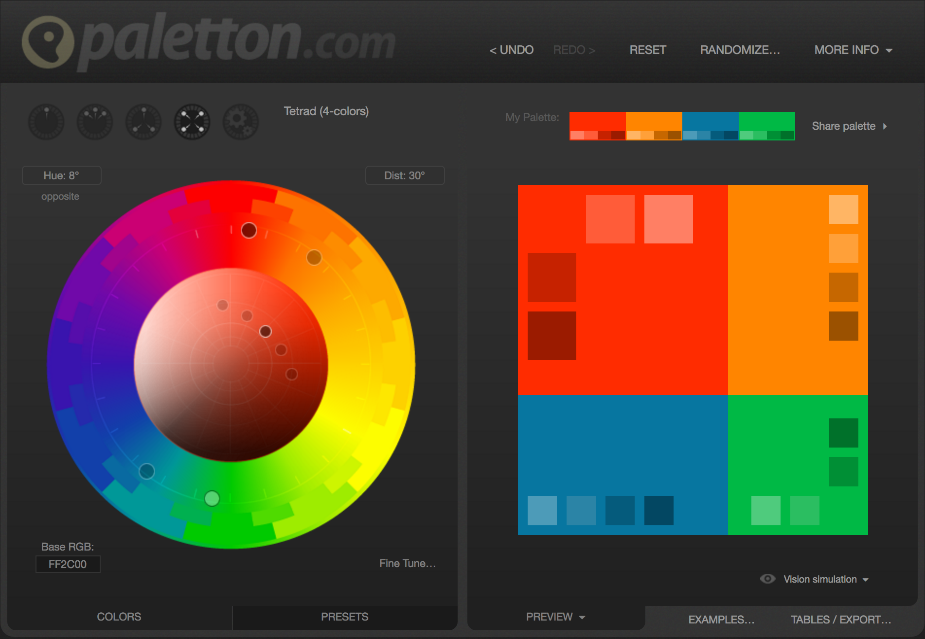
We have selected the “tetrad” option (see in the upper left part of the figure above) to get 4 main colors for our scheme, taking #FF2C00 as base color. Note that in addition to these 4 colors, other 4 additional colors, for each main color, are suggested. So we have a total of 4 + (4 x 4) = 20 colors to work with, which is far more than we will actually use in this example.
From the 4 main colors of the scheme, we will assign:
- the red (#FF2C00) to h1
- the orange (#FF8500) to h2
- the green (#00B945) to h3
We will use the blue for the top navigation links, later on.
Since we are styling the h tags, we will also assign some custom font-sizes
|
1 2 3 4 5 6 7 8 9 10 11 12 13 14 |
h1 { font-size : 3em; /* That's BIG! A statement, really */ color : FF2C00; } h2 { font-size : 1.5em; color : #FF8500; } h3 { font-size : 1.2em; color : #00B945; } |
In our page however, not all h1 tags are the same. For instance, in the aside section (that becomes the left grey box in the final site), we have a distinct h1-h2 hierarchy. You may remember that aside is a sectioning element, and as such it can have it’s own h tags. We want the h1 and h2 tags used inside the aside element to have a different size (yet the same color), from the default h1 and h2 sizes that we have just styled.
Within the aside element, we will also eliminate the top margin that is normally present in the h1 tag, for design purposes.
Those declarations, placed somewhere in the stylesheet after the first h1 and h2 declaration, will override certain aspects (font-size) assigned before. Colors will be inherited from the previous declarations for h1 and h2.
|
1 2 3 4 5 6 7 8 9 10 |
aside h1 { font-size : 1.2em; margin-top : 0px; } aside h2 { font-size : 1em; } |
Styling links
In our example we will have two different kind of links: the top navigation menu links and the ordinary links.
For the ordinary links we will use a light blue from the color scheme above, #3AA6D0. We will also state that links should not be displayed as underlined text, which is kind of old fashioned. To do this we set the value of the “text-decoration” property to “none”. By default (user agent settings) it is “underlined” instead.
|
1 2 3 4 5 6 |
a { color : #3AA6D0; /* this is a light blue from the color scheme */ text-decoration : none; } |
The top menu navigation links will be bold. We will assign them the blue from the main color scheme colors, #0776A0.
Remember they are contained within a nav element. So we can access them by defining nav as the context.
|
1 2 3 4 5 6 |
nav a { font-weight : bold; color : #0776A0; /* this is the main blue from the color scheme */ } |
The “text-decoration : none;” declaration will be inherited from our previous declaration on a elements, therefore also the top navigation links, as all links, will not be underlined.
We have not done it in this example, however you can control the color of a linked text when you mouseover it and differentiate between a link that was visited or not, by using the a:hover, a:visited and a:link CSS selectors. See here for more details.
Styling lists
ul lists can be extensively styled, to the point you do not recognize a list as such.
For instance, take a moment to look at the final web page in figure 3-9-3. How many lists do you see? Honest.
Don’t scroll down, take your time please
…………………
…………………
…………………
…………………
…………………
…………………
…………………
…………………
If you answered 2, you missed the fact that the top navigation menu links are part of a list, check out the page source code at the beginning of this section.
The fact that the list (li) elements are displayed inline instead of in a block arrangement (“display : inline;”), and the fact that there are no bullets (” list-style-type : none;”), are misleading and “hide” the list nature of this part of the page. However the top links are indeed arranged in a list. Here are the relevant CSS declarations:
|
1 2 3 4 5 6 7 8 9 10 11 |
nav ul { list-style-type : none; margin : 0px; padding : 0; } nav li { display : inline; } |
You will also note that the other two lists in the page are styled. They are different from each other, and none of them has the default appearance of a list (see figure 3-9-2 for the un-styled version).
We have created 2 kind of list styles. One applies to lists inside the aside element. These lists (we have one in the example) will have squares instead of the default bullets. The color of the squares will be the orange from our color scheme, #FF8500.
Also, we increase the default spacing between the lines (line-height), in order to better space the list elements.
|
1 2 3 4 5 6 7 |
aside ul { line-height : 1.8em; list-style-type : square; color : #FF8500; } |
For the second kind of lists, we create a class that we call “body-list”. The list in the example, the one with the arrows, to the right of the page, was assigned this class:
|
1 2 3 4 5 |
<ul class="body-list"> ..... </ul> |
And this is the declaration for the class in the stylesheet:
|
1 2 3 4 5 6 7 |
ul.body-list{ list-style-position:inside; list-style-image: url('../images/small_arrow.png'); line-height : 1.8em; } |
By using the list-style-image property we can use an image instead of bullets or squares, for highlighting each line. In this case we have used a little arrow icon that we made with powerpoint. Please note that when you use a path in a CSS file, the path will be relative to the location of the CSS file itself, not of the HTML page that imports it.
Styling Paragraphs
In this example we have done nothing special to style the paragraphs, except the little thing explained below. A typical property to be manipulated for paragraphs could be the line-height, in order to space text as we wish. Another could be to assign a margin-bottom property to space each paragraph from the next one by a defined amount of pixels.
We have defined a “quote” class, associated to italic text, to be used in the “Daily Quote” box in the aside. Boxes in the aside are delimited by div elements (generic containers). The quote class was assigned to the relevant div rather than to the paragraph.
|
1 2 3 4 5 |
<div class="quote"> <p>"It is a scientifically proven fact that...."</p> </div> |
and then, in the stylesheet:
|
1 2 3 4 5 |
.quote p { font-style : italic; } |
Styling the aside element
You have surely noticed that, unlike in the unstyled page, the aside element looks like a lateral grey box in the final page.
This box was assigned a width of 320 pixels. It “floats” to the left of the other contents thanks to a “float : left;” declaration.
It has a small 5 pixels padding and a relatively dark grey (#D0D0D0) background surrounded by a solid (made by a continuous line) tiny border (1 pixel) of a slightly darker grey (#A8A8A8):
|
1 2 3 |
border : 1px solid #A8A8A8; |
In order to keep it a little bit apart from the rest of the page contents, we will assign the aside element margin-right and margin-bottom properties.
Since the item is aligned to the left, we don’t need any margin-left, we already have the 10 pixels of the body padding on this side. Also the top is quite empty, no margin needed on the top either.
To make a long story short, here is the CSS aside declaration:
|
1 2 3 4 5 6 7 8 9 10 11 |
aside { float : left; width : 320px; margin-right: 20px; margin-bottom : 15px; background-color : #D0D0D0 ; padding : 5px; border : 1px solid #A8A8A8; } |
Styling divs
The boxes in the aside are delimited by div elements. To make them visible, we have assigned them a light grey background. Some padding was added (5 pixels), to keep text apart from the borders. A margin-bottom was included to space the divs from each other.
|
1 2 3 4 5 6 7 |
aside div { padding : 5px; background-color : #F0F0F0; margin-bottom : 15px; } |
We will cover advanced div styling extensively in the next sections of this chapter.
Styling the img tag
In this example we use the DNA square image as a top logo. We assign this image a class “top-image”:
|
1 2 3 |
<img src="images/dna_square_100x100.png" alt="dna square" class="top-image"> |
In order to adapt the size of the image to the title of the page, we use the width property to resize the image to 50 pixels. On defining either the width or the height, the image will scale accordingly on both dimensions. We float the image to the left of the page title with “float : left;”. We also assign a margin-top, in order to better align the image with the page title, vertically. A margin-right is used to space by 30 pixels the image from the title.
|
1 2 3 4 5 6 7 8 |
img.top-image { height : 50px; float : left; margin-top : 10px; margin-right : 30px; } |
Full CSS file
And here’s is the full CSS file, style.css, where we put it all together
|
1 2 3 4 5 6 7 8 9 10 11 12 13 14 15 16 17 18 19 20 21 22 23 24 25 26 27 28 29 30 31 32 33 34 35 36 37 38 39 40 41 42 43 44 45 46 47 48 49 50 51 52 53 54 55 56 57 58 59 60 61 62 63 64 65 66 67 68 69 70 71 72 73 74 75 76 77 78 79 80 81 82 83 84 85 86 87 88 89 90 91 92 93 94 95 96 97 98 99 100 101 102 103 104 105 106 107 108 109 110 111 112 113 114 115 116 117 118 119 120 121 122 123 124 125 126 127 128 129 130 131 132 133 134 135 136 |
html {background-color : #F0F0F0;} body { width : 980px; margin-left : auto; margin-right : auto; font-family : Gill Sans, sans-serif; font-size : 1.2em; color : #404040; background-color : white; padding : 10px; padding-top : 0px; } a { color : #3AA6D0; text-decoration : none; } /* H TAGS */ h1 { font-size : 3em; color : FF2C00; } h1.toptitle { margin-bottom : 10px; } h2 { font-size : 1.5em; color : #FF8500; } h3 { font-size : 1.2em; color : #00B945; } /* ASIDE */ aside { float : left; width : 320px; margin-right: 20px; margin-bottom : 15px; background-color : #D0D0D0 ; padding : 5px; border : 1px solid #A8A8A8; } aside h1 { font-size : 1.2em; margin-top : 0px; } aside h2 { font-size : 1em; } aside div { padding : 5px; background-color : #F0F0F0; margin-bottom : 15px; } aside ul { line-height : 1.8em; list-style-type : square; color : #FF8500; } header { margin-bottom : 40px; } /* NAV */ nav { text-align : center; margin-top : 0; } nav h1 { display : none; } nav ul { list-style-type : none; margin : 0; padding : 0; } nav li { display : inline; } nav a { font-weight : bold; color : #0776A0; } nav hr { width : 300px; margin-right : auto; margin-left : auto; background-color : #63DC90; color : #63DC90; height: 3px; border:3px; } footer { text-align : center; font-size : 0.8em; font-style : italic; } img.top-image { height : 50px; float : left; margin-top : 10px; margin-right : 30px; } .quote p { font-style : italic; } ul.body-list{ list-style-position : inside; list-style-image : url('../images/small_arrow.png'); line-height : 1.8em; } |
So there you have it, a fully styled web page.
You can download the final code and images here.
We encourage you to learn more about CSS by exploring the relevant pages in the w3schools website and/or by proceeding to the next section.
Chapter Sections
[pagelist include=”135″]
[siblings]